Without the havens of work and school, I spent too much of last week prowling political websites and going gray over the election. Considering how much time I spent starting at the American geography in red and blue, it should prove little surprise that Monmonier’s chapter on Maps and Political Propaganda sparked my interest.
Early in this chapter, Monmonier writes, “People trust maps, and intriguing maps attract the eye as well as connote authority” (87). I’m interested in how electoral maps are architected to attract—and instruct—the eye. While I have not noticed any conspicuous differences in the scales of the states (for example, Fox News does not double the size of Texas), the color-coding of swing states and selection of electoral detail may help determine how readers read these maps.
Monmonier supplies a couple of good examples on the import of color. In Figure 7.5: Visual proof of Arab lie of Israeli “aggression” (95), a tiny white Israel is girdled by black Arab states in the Middle East and Africa. Similarly, in 7.15: Repatriation: Background for Peace (106), Monmonier observes, “To the east in stark, depressing black looms the Soviet Union, and to the south in pure, hopeful white lies Germany (106). Color counts, and it’s difficult to overlook the racial coding in the aforementioned examples.
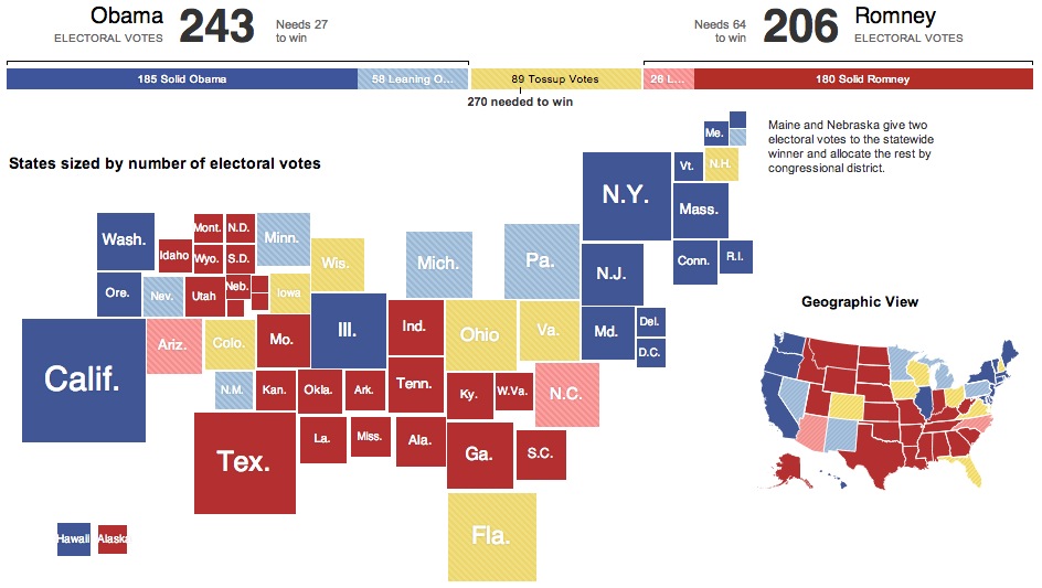
I did not see racial coding in electoral maps—let’s leave that to campaign surrogates—however, the colors assigned to swing states matter. Take Rasmussen Reports, which oversamples Republicans and tends produce polling most-cited by the Drudge Report. In their electoral map, Rasmussen shades swing states purple, a shade deceptively color to that of “Strong Romney” states. Left-wing HuffingtonPost, meanwhile, omits Rasmussen polling from its averages, and uses the New York Times electoral map. This means that some states, such as Ohio, Nevada, Wisconsin, and Iowa turn light blue (“Lean Obama”), while the remaining swing states are an unmistakable yellow. As with most newspapers, NYT uses yellow to connote swing states. While the NYT map is more cautious than that of HuffPo (with the exception of Nevada, their is identical to that of Rasmussen), NYT does something unique: In addition to the traditional geographically-scaled map of the United States, it supplies a second map that scales states by electoral weight (population).
Consider this population-weighted map a corrective to many maps on right-wing sites that emphasize geographic-dominance. Take this map, based upon 2004 congressional districts, from RedState.com.

The last point I would make is that selection of information also matters. Compare poll aggregator Real Clear Politics with the left’s bête noir, Fox News. In many ways, these maps are remarkably similar. Fox News builds their default map on RCP and uses the same gray shading for swing states (gray). Where they differ, however, is in what the maps emphasize. RCP lists electoral votes for each state, including competitive districts in Nebraska and Maine, and supplies a key for the crowded Northeastern states. Fox News, skips such details, and instead prioritizes its punditry, supplying speculative maps from Karl Rove and Joe Trippi. That Fox displays these maps as equivalent to that of poll averages (RCP) suggests that the network prioritizes partisan engagement.
Comments are closed.